
3 Things To Get Rid Of On Your Website
You can have all the bells and whistles on your website, yet convert absolutely no traffic into sales.
You’ve probably spent more money on the latest trending WordPress theme, coded more sophisticated CSS animations, included epic photography, or added that catchy bold tagline inspired by Nike’s Just Do It.
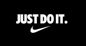
Problem is, you’re still yelling JUST DO IT! when it still isn’t converting.
While you’re watching for sales to increase in number, the only number increasing is your bounce rate when people leave your website faster than a Ferrari going from 0-100.
And back to the drawing board you go, working on version 56 of your new website with an SEO company.
Here’s a startling fact: Pretty websites don’t sell, clear and concise messaging does. People buy because of the words they read, not the abstract graphics they see.
Your pretty website will only serve your ego, not ROI.
We’re going to let you in on the 3 things you MUST get rid of or change on your website, to stop people from running:
#1 Rotating Slideshows
Hate to break it to you, but rotating slideshows are conversion killers and must be removed immediately.
Perhaps you have one on your website right now. And who can blame you? What a great way to fit 1,000 images on the most important piece of real estate on your website, right?
Wrong.
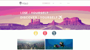
Image credit: Wix Blog
Rotating slideshows are a major distraction to the eyeball. They don’t even look cool.
Have you ever driven past a digital sign on a freeway? Chances are you would’ve never seen or remembered any ads, because it’s constantly changing before you’ve even had a chance to glance at the message.
People land on your website trying to analyse your message, and before they’ve even had a chance to process how you’ll benefit their lives, it disappears to the next one.
Conversion-proven websites have a single static image of what success looks like for your customer after doing business with you. Layer that image with a clear and concise statement on top, and watch your conversion rate go up at scale.
At the end of the day, what the customer really wants is a transformation, not an experience.
If you’re a builder, this could be a simple picture of a family in their brand-new home having dinner, accompanied by a simple tag line – “Custom build a home 100% suited to your lifestyle”.
Slideshows create message overload, often leading to confusion. In digital marketing, clarity is the name of the game. Get rid of it and replace it with a simple image and tagline that paints a picture of success.
Now, you’re probably thinking: “How can I sell myself!?” “How do I highlight all my capabilities, recognitions, awards, portfolio?” “How can I do that in a single image!?”
Bad news is, customers don’t care – that’s not what they want. More on that in this blog
#2 The ‘About Us’ Page
Sorry to be blunt, and a little black and white – but customers don’t care about you.
Customers aren’t looking for your ego, and they’re certainly not assessing a competition of who can perform the best brag. Customers engage with your marketing looking for a solution to their problems; and they engage with businesses when they can see themselves in the products, overcoming their challenges.
Having said that, do us a favour and delete the ‘About Us’ page now.
Get rid of the long-winded paragraphs of your mission statement, values and core beliefs. Get rid of your team biographies, your building, your machinery; and heaven forbid.. That picture of your cat.
Customers come to you expecting that you already have what it takes to help them. Therefore, use every single opportunity to speak into your customers problems, their wants and needs, and how you come in as a guide to help them win the day.
Yes, play the guide, rather than the hero. We’ve addressed this numerously and will keep banging on this drum – How to Lose Customers With Story Telling.
People are far more likely to buy from someone who will walk alongside them while overcoming their problems, rather than a self-confessed know it all.
#3 The Drop-down List From Your Navigation Bar
That bar at the top of your website with drop-down list upon drop down list needs to go. You don’t need 60 pages to sell your product!
The greatest tactic used by SEO companies today to boost rankings is drop-down lists. Drop-down lists that link pages upon pages of information that get in the way and lose your customers.
While being first on a search engine might give you bragging rights, not being able to convert under a cloud of information-overload will quickly bring you back to reality.
Have you landed on a website before and been annoyed by the drop-down lists that got in the way? Chances are you probably only remember the website for one reason – it was annoying!
Your navigation bar should never have 5 tabs full of drop down lists, as seen below:
![]()
Customers shouldn’t have to sort through pages information to find your products! You website needs to communicate clearly with customers, through simple and concise messaging.
Here is a perfect example of what it you navigation bar should look like:
![]()
Navigation bars should only provide links to 3-4 pages. If you really need to include other pages then put these in the footer, or as we like to call it – the junk draw.
Stop filling your navigation bar with drop-down lists, just to boost SEO.
Pretty websites don’t sell – hopefully you understand that by now. If your website has any of these 3 things, change it!
Don’t keep losing customers!
Your website should be serving your ROI, not your ego. We understand that it can be difficult to get right and create a website that brings in real leads.
If you want to rebuild your website and convert those ‘onlookers’ to real leads, here are some free web templates that will help you to flirt to convert.